By Charlotte Fryar, 2015 Project Manager
Project Process
In the summer of 2015, Dr. Whisnant and I began our requisite scan of the university history landscape for resources on which to build our yet-to-be-named project. Who had already attempted to answer some of our research questions? Where had they succeeded? Where could we improve? The two resources that we returned to again and again–and which now form the basis for much of the data presented in the visualization–are UNC’s Plan Room Database and the UNC Library’s digital exhibit, Names Across the Landscape.
The Plan Room Database contains extensive information for almost every building on our campus, but it lacks information on the namesakes of buildings. Similarly, Names Across the Landscape provides a small summary for namesakes of buildings, but little information about the buildings themselves.
Neither resource had yet answered the questions our students were asking: How many buildings are named for people of color, and where are they in relation to buildings named for slaveholders? Were buildings named for white supremacists built in one era, or many? How many buildings have changed purposes from their construction to the present day?
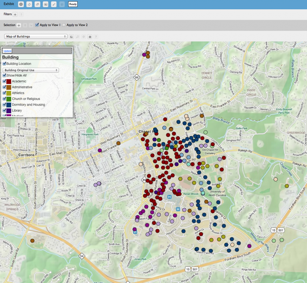
Click this image to go to our Prospect visualization containing information about over 250 major campus buildings.
From a list of over 250 “major” buildings (generally buildings over 5,000 square feet, as defined by Facilities Services), we assigned each student roughly 30 buildings and 20 building namesakes they were responsible for collecting information on. All the data students collected is present in the visualization.
Though the Plan Room Database and Names Across the Landscape served as an essential foundation for student research in data collection, they also consulted The Carolina Story: Virtual Museum, Commemorative Landscapes of North Carolina, NCPedia, Documenting the American South, Virtual Black and Blue Tour, UNC Library Exhibits, Photographic Archives, UNC Library, and Wikipedia.
As a lab associate in the Digital Innovation Lab (DIL), I have participated in countless conversations on the utility of applying digital humanities tools on public projects. Any tool you might use needs to be capable of doing deep analytical work, but at the same time, remain inviting to a public audience. The first movements towards the creation of Names In Brick and Stone occurred at the same moment that the DIL was rethinking how its first digital humanities toolkit, DH Press, could be repurposed and improved to do that deeper analytical work, but still hold onto its strengths as a public platform for scholarly interpretation of humanistic data. The building of the new toolkit, Prospect, occurred during the same months that research and data collection were done for Names In Brick and Stone. Our class has been fortunate to have Michael Newton, the lead developer for Prospect, assist us in working with a tool that is new to us, the UNC community, and larger digital humanities networks. Names In Brick and Stone is the first public project built using Prospect, and thus, it should be understood that it may have constraints that preceding digital tools may not have. But we take our lead from a university whose history is run through with experimentation and innovation, and have jumped on board with this new tool.
Reflexive Practice
Data visualization is often presented as an end-game, as in a “The Ends Justifies The Means” game. Before there is a map, a timeline, or a gallery, there is often spreadsheet in which the minutiae and intimacies of people’s lives have been condensed into rows of information taken from a controlled vocabulary. As digital humanists and public historians have adopted visualization tools to communicate with public audiences, they have used graphical displays of information borrowed from scientific disciplines. Often, these tools are employed with an understanding that the information they display is certain and correct. Humanists, and perhaps, especially historians, know that the knowledge we present is always interpretative and often ambiguous. Nuance and complexity — the cornerstones of historical inquiry — are difficult to capture in data visualization. Finding the line to tread between ambiguity and certainty is difficult, and involves making decisions during the process of data collection and configuration that will create a visualization that is both informative and intelligible.
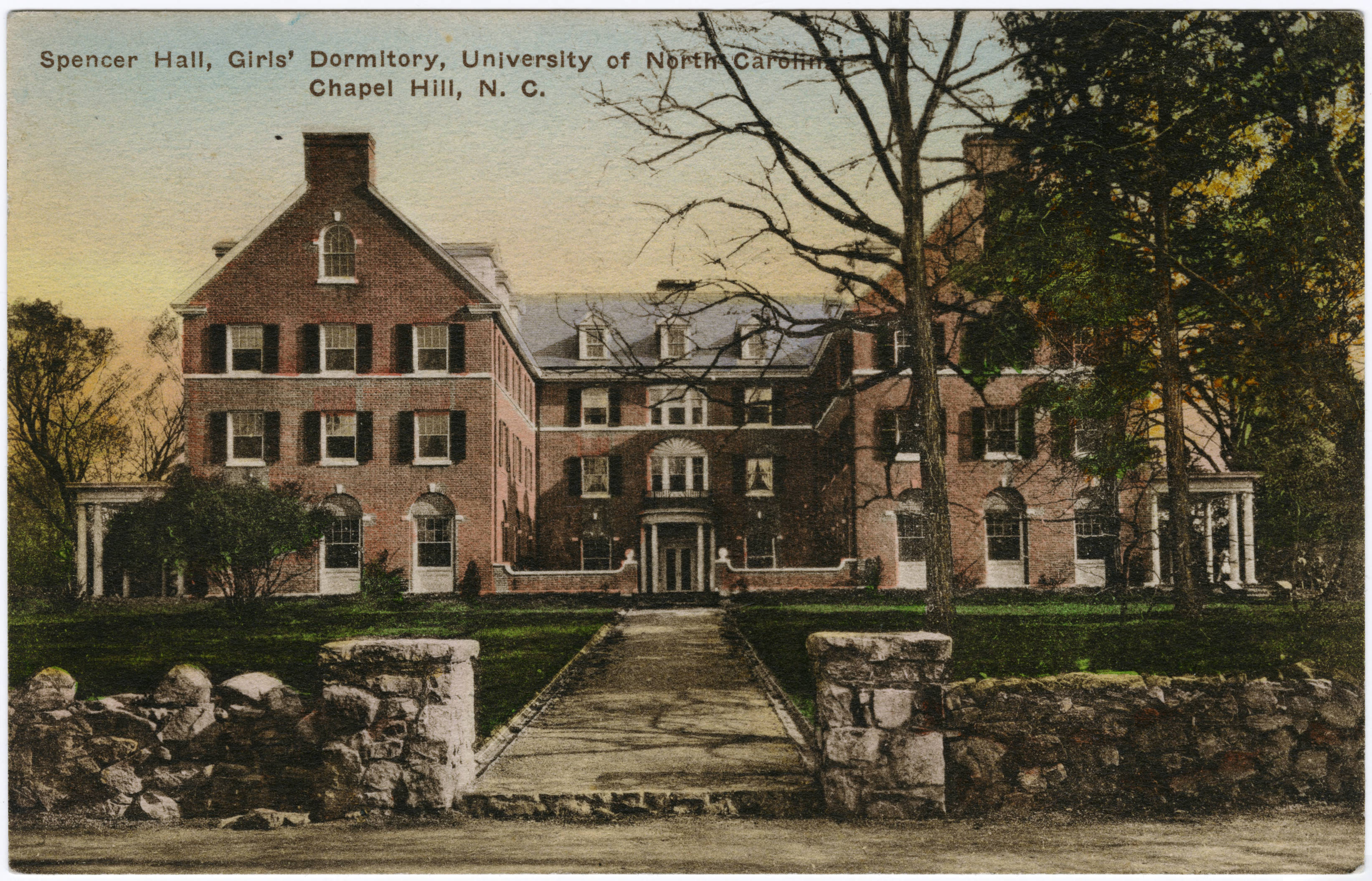
Spencer Residence Hall, Women’s Dormitory, c. 1920.
In building Names In Brick and Stone, I have attempted to choose categories for our data that could display some of the nuances of our university’s landscape, so often painted as either an ode to hordes of white supremacists or a memorial to our greatest alumni. Of course, our built landscape is neither.
By providing a way to visualize the intersectionality of namesake identities and the significance of buildings, Names In Brick and Stone allows for a more nuanced interpretation of our landscape. While one namesake might have taken part in the white supremacist campaigns of the early 20th century, they might also have played a role in supporting women’s education in the state. One building might represent an expanded space for women on campus, but the writings of its namesake against people of color might shadow over the legacy of the building.
If we have reached our goal of building a nuanced, informative, and intelligible data visualization, users should leave our project with answers and questions, both of which we would like to hear. Names In Brick and Stone is working, living, and growing, and we welcome feedback, contributions, suggestions, and dialogue to help it continue to do so. It is our hope that the visualization will point the way to other resources, information, and insights on the complicated campus landscape and social network to which we are all affiliated.